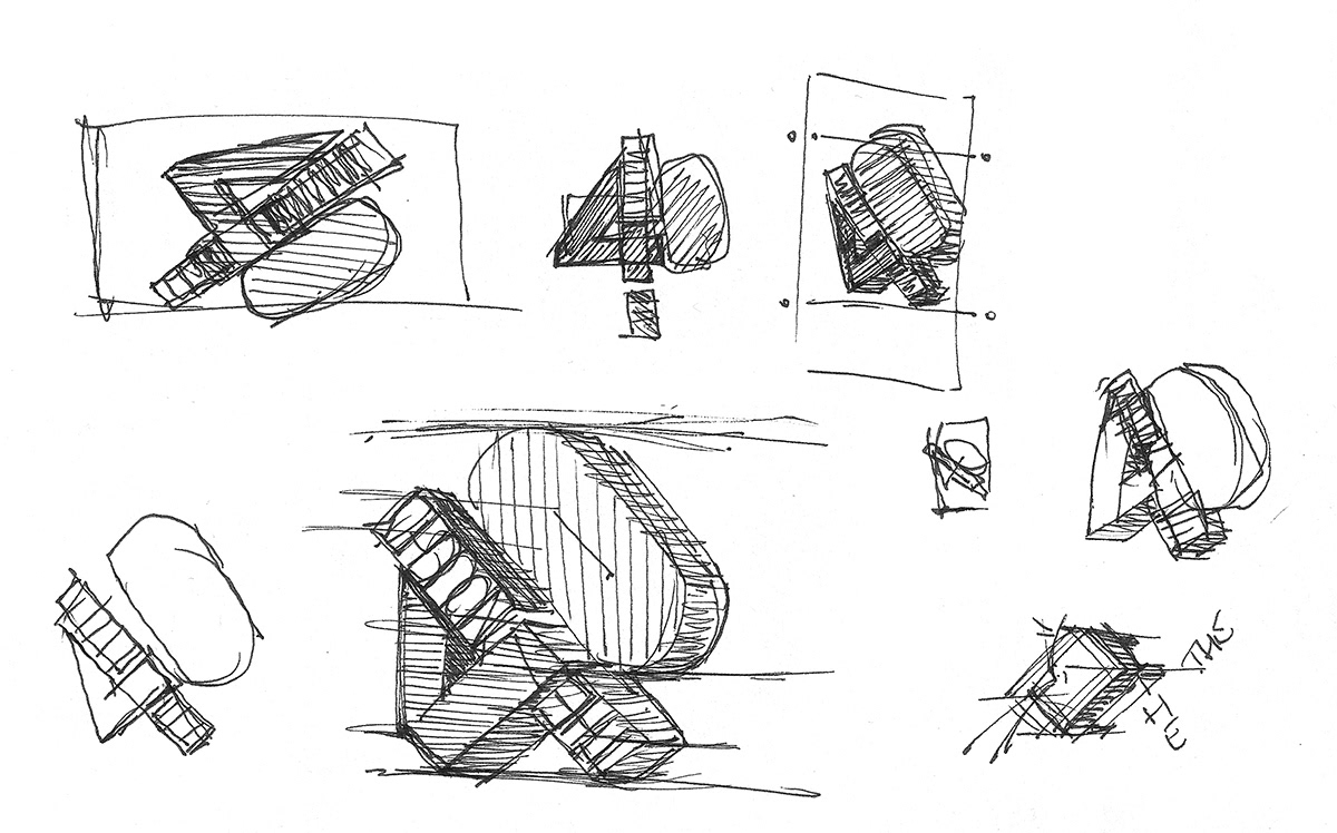
From sketch to screen - The initial ideas of getting a strong logo style for an on-screen title sequence.
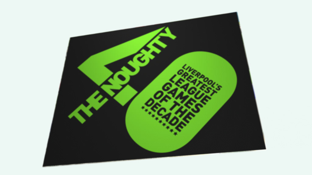
Working with such a long title - "The Noughty 40 - Liverpool's Greatest Forty Games of the Decade" the challenge here was to create a legible logo mark the carried the complete title and contained it into a strong visual identity.
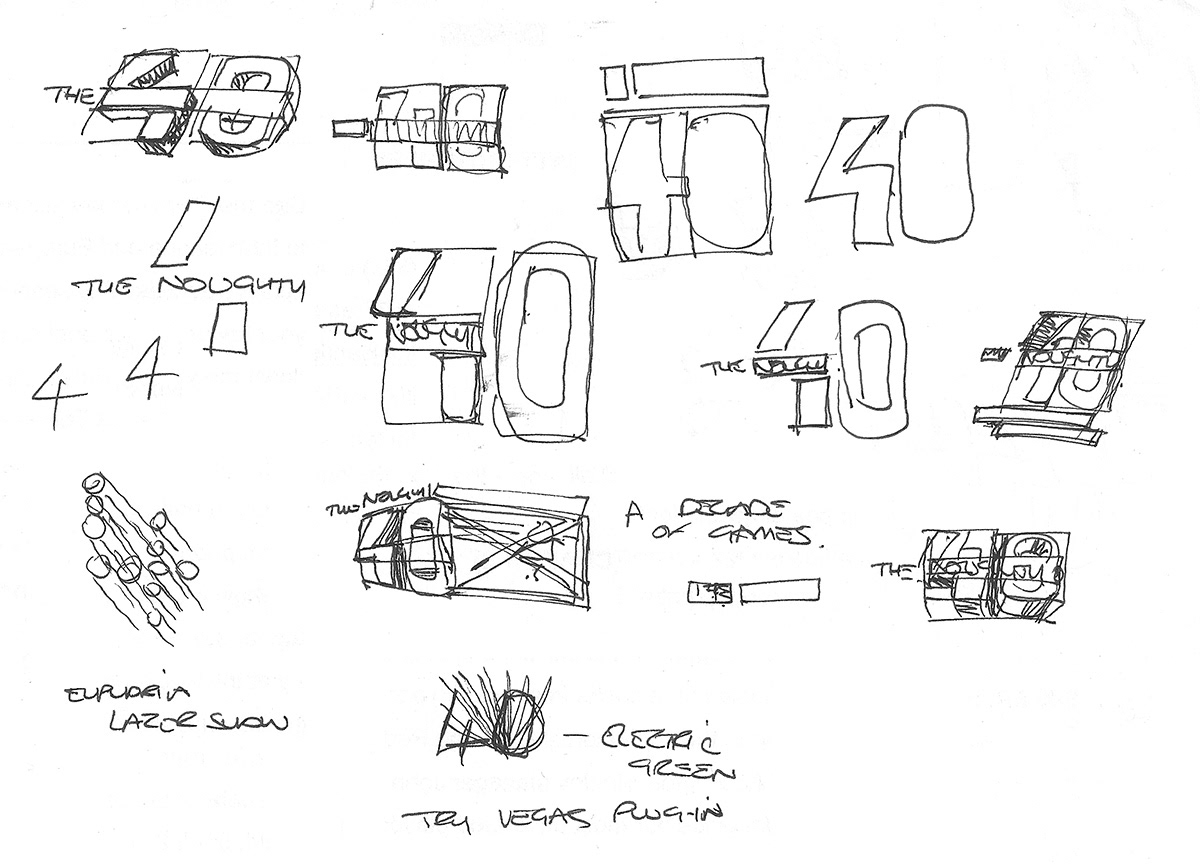
Sketches helped me work through ideas and layouts, looking at options and angles on how to pull it into a tight lock-up. Notes on approaches also added.
The resulting idea started to come out. Part of the problem was how to keep legibility to the text whilst also conveying the numeric weight of 40 so that resulted in the final angular approach where both the subtile and main title can be read at the same time. Having it straight on at 90 degree angles wouldn't work.